Monday, April 30, 2012

Back to Basics

I had to take some time out to clean up my messy studio.  It looked like a bomb hit and there were things spread out all over the room.  It was getting to the point that I didn't know where anything was, so I decided to put all my energy into cleaning up and organizing my supplies.  I now enjoy walking into "my space."  It is MY little part of the house where I can create anything I want and be by myself.  I find it easier to be creative if no else is around distracting me.

The rain was coming down in buckets today, which put a kink in my plans to go scouting painting spots and taking some photos now that most of the trees have leaves on them.  Hopefully it will clear up for tomorrow, because I NEED more landscape photos.  It seems like the more I paint, the more I don't like using photos that other people take.  Maybe I can connect to my own photos because I have been to the place I am painting.

It has been a few days since I last painted, so I thought I would keep things simple.  I haven't painted a pear for a while, so I grabbed a pear and my gouache and painted.  It isn't the most exciting painting, but I painted and it felt good.

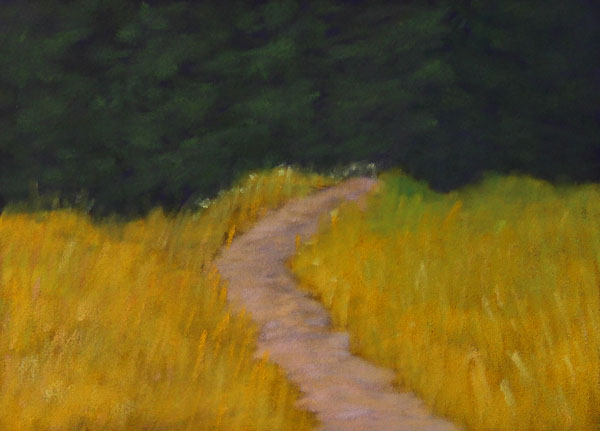
This is painted on 5 x 7 cold press water color paper, primed with Rich Beige Art Spectrum Colourfix Primer.  I could use this as an under painting and put pastel on top.  Hmmm.... maybe I will just do that.  If I do, I will post the results.

As always, thanks for looking.  I will share a couple of photos of my nice clean studio.  It won't stay that way for long.

#27

My pastels

The working area

The view from the drawing table

It's a wonder that I get anything done.  I could look out the window all day long.  If I go over to the left side of the table, there is a view of Shuswap Lake.  If I ever need motivation to learn how to paint landscapes all I have to do is look outside.  I will share more photos when the weather gets nicer.

Doug

Wednesday, April 25, 2012

Mixing Greens

The other day I watched a video by Liz Haywood-Sullivan on using greens in a landscape.  She used a pastel and alcohol under painting of orange for greens in light and dark red for areas in shade.  She showed how it was possible to use green as the dominant color in a landscape painting.

I will watch the video again to really study her method, but not today, because I was itching to paint.  It has been a while since I have been able to paint, but it should be clear sailing for the foreseeable future.  There are a thousand ideas bouncing around in my head and I just want to paint and paint some more.

This painting was started with a pastel and alcohol under painting, using a light orange for the grass and a darker orange for the sunny part of the trees.  I think she used the same orange for both.  Now that I have done this, I think a darker orange for the ground would enable the greens to show better.  I used a dark violet for the under painting in the shaded part of the trees.  A light yellow was used for the sky and two different violets for the background trees and hill.

The painting is done on 5 x 7 UART 400 grit sanded paper and I used a variety of pastels.  It sure felt good to be able to paint again.  Thanks for looking.


Doug

Wednesday, April 18, 2012

Back to the Sticks

It was time to take the sticks out to play with, because I think they were getting jealous of their cousins, the Pans.  So I put the lids on the Pans and stacked them on the corner of my pastel table and moved the sticks to the front and got my fingers dusty.  It felt good.

I usually like to start a pastel painting with some kind of an under painting.  This one was started with a pastel and alcohol under painting.  The alcohol sets the pastel into the tooth of the sanded paper and leaves most of the tooth for my heavy handed application of the pastels.  I need all the tooth I can get.

This isn't the most complicated painting I have ever done, but I needed to get something done.  I seem to be at a stage where I have to make myself paint.  Is that a good thing?  Maybe.  If I wasn't doing this challenge, I think there would be a very good chance that I would have been sitting on the sidelines and not painting.  At the end of the month I would look back and wonder why I hadn't painted more often.  Doing this challenge will get me painting and that is the only way to improve.  Mileage at the easel!

This is a 5 x 7 pastel painting done on UART 400 grit paper.  Thanks to Paula Ford for the reference photo.   Hmm... those sky holes could be better.  Oh, well.  Thanks for looking.


Doug

Monday, April 16, 2012

Lemonade?

I wasn't happy with the outcome of this painting, (what's new?) so after I took a photo I decided to have some fun.  I shouldn't say that, because I usually have fun when I am painting.  Let's say it was time to cut lose.

The painting was finished off without the aid of the photo reference I started with.  It was time for imagination and feel!  Put those colors down and be proud!  Contrast!  Color gradation!  Brushstrokes!  (Well, actually they are sponge strokes)  It was fun to do this on a rainy, dull day that needed to be brightened up.

This is another Pan painting on 5 x 7, 800 grit UART paper.

Lemon


Lemonade?


Maybe not.  lol  Thanks for looking.

 
Doug


Friday, April 13, 2012

Across the Lake

After working on Pastelmat with the Pans, it crossed my mind that UART 800 grit paper should suit Pans as well.  I have tried the 800 grit paper a year or two ago without any success, but I thought it was time to give it another go and am I ever glad I did.  The paper doesn't hold as much pastel as other sanded paper, but the pans blend nicely and go on smoothly.  It will just take some more use to find out want I can and can't do with this paper.  I have quite a stash of it, so I am a happy camper to find a way to use it.

This is painted from a photo I took last summer while walking the trails at the bird sanctuary in Salmon Arm, BC.  I liked the view of the hills across the lake and the clouds just added to the scene.  These types of clouds are quite common around here and I am glad about that.  It is painted on 5 x 7 UART 800 Grit paper using Pan Pastels.

Thanks for looking.

#23


Doug

Wednesday, April 11, 2012

Cloudy Shuswap Day

Today's painting is painted from a photo I took from the public wharf in our new home town, Salmon Arm, BC.  Now that we are settled in, I want to wander around and discover new painting opportunities and build up the photo references and look for some good painting spots.  There is so much around here.  Mountains, lakes, rivers, farms, old barns and fifteen minutes down the highway there are desert like scenes.  

This is the fifth day in a row that I have posted a painting.  I think this challenge thing is working.  This is another 5 x 7 painting, painted with soft pastels and Pans.  It is painted on dark grey Pastelmat.  The clouds are one thing, but this is the first time I am happy with the water reflections.  I am starting to put things together.  Might be time to try a larger painting.

Thanks for looking.


Doug

Tuesday, April 10, 2012

Clouds 2

Can't win them all.  These clouds didn't turn out the same way as the first ones did, but to keep things real, I am posting them anyway.  This blog and challenge is all about trying new things and tackling subjects that have been a problem for me to paint in the past.  If you don't try something, how will you ever learn?  I am past the stage of worrying about what others think about my paintings.  I enjoy the process of painting and if the painting turns out, that is a bonus.  Does that make any sense?  I learn something with every painting.

This is another Pan Pastel painting, painted on 5 x 7 Maize Pastelmat.  I am also posting a revision of the last painting.  I changed the shape of the top cloud, because it was the same shape as the bottom cloud.

Thanks for looking.

#21


Painting #21 Revised


Doug


Monday, April 9, 2012

Clouds

You would think there were only sunny days in my life when looking at my landscape paintings.  Very rarely would you catch sight of a cloud.  Why?  Because I can't paint clouds!  Whenever I tried they would look like heavy clumps that couldn't possibly float in the sky.  "Look out below!"

This challenge is all about experimenting and trying new things, as well as slaying dragons of the past.  So, after deciding to attempt a cloud painting, I went to the PanPastel site and watch a half hour free video on painting clouds by Deborah Secor.  It was very helpful and I highly recommend it.  The price is right.

This is another Pan pastel painting and is painted on 5 x 7 Maize Pastelmat.  It is painted from a reference photo I took from our backyard.  As soon as I took the photo, I knew it was a good reference photo.  Not all photos are.  

Thanks for looking.

#20


Doug

Sunday, April 8, 2012

Mount Ida

Mount Ida makes a perfect backdrop for our small city and I am sure every artist in Salmon Arm has painted it at least a dozen times.  I took a photo of Mount Ida from our backyard the other day and decided it was time for my first attempt to paint the local landmark.

The mountain turned out okay and it is the first time that I have something that resembles clouds, so I am happy with that, but there are too many trees.  Boring!  The next time, maybe a panoramic view of the mountain with just a few trees showing would make for a more interesting painting.  Actually, I had quite a few ideas pop into my head while painting this, so there may be more paintings of Mount Ida in the near future.

This is another 5 x 7 pastel painting, using Faber Castell Polychromo, Mount Vision, Unison and Pan pastels and is painted on Buttercup Pastelmat.

Thanks for looking.


#19


Doug

Saturday, April 7, 2012

Taking it Further

We have all had that painting that taunts you.  The painting that gets under your skin and there doesn't seem to be a damn thing you can do about it.  That was my last painting.  I hated it, but could see some potential.  I worked on the sky and was happy with it.  Then tree was tended to, until it looked okay.  So far, so good. Then came the grass.  The bloody grass!!!!  I just couldn't get it!  I ended up wiping all the pastel off left of the path yesterday and went back to it today.  I am not overly pleased with the outcome, but it is an improvement.

Anyway, it doesn't count as another painting, but I thought I would post it.  Most of the revisions were done with soft pastels.  Okay, NOW I can move on.  Ain't this fun?


Doug

Thursday, April 5, 2012

Standing Tall

It took two days, off and on, to paint this and I always struggle when it takes longer than a day to finish a small painting.  I don't know if I lose my vision or I lose interest, but I have noticed the one day paintings seem fresher.  I can't use pain as an excuse or I will never paint.  Pastel paintings take longer than gouache, so maybe I have to look at gouache more seriously and paint in pastel only when I am having a good day.  The problem is, I never know when the good days are coming.  Oh well, I know things could be worse.

This is a 5 x 7 pastel painting done on Belgium Mist Wallis sanded paper, painted with a variety of soft pastels and Pan Pastels.  The photo reference is from the Wet Canvas RIL.  The sky and tree were mostly done on the first day and the grass and path on the second day and I like the first days work the most.  I remembered sky holes this time, so all is not lost.

#18


Doug

Tuesday, April 3, 2012

A Path To?

This time I used a very dark paper, which made the whole painting darker.  I wanted the pines to be dark to make a nice contrast with the grass and path, without the path being too bright and sticking out like a sore thumb.  I actually like this one, but after the last painting, anything would be an improvement.  

This is painted on 5 x 7 dark brown Art Spectrum Colourfix paper using Pan Pastels.  I used a reference photo from the Wet Canvas IRL.

Here is #17.  Thanks for looking. 


Doug

Monday, April 2, 2012

Road to Nowhere

It went from bad to worse.  It started with another gouache under painting and then I added Pan Pastels.  I wasn't happy with the results, so I added soft pastels.  I guess you get the idea, but not what I had in mind. I remember when I came across this scene.  I was out hunting for photo references in the back roads of the town we used to live in, Houston, BC, and I turned a corner and came to a stop.  I loved how the shadow went across the gravel road and the strong contrast of the shadow and the sun drenched trees.  I might try this painting again, after I do some plein air painting.

It is painted on 5 x 7 light grey Pastelmat and I think I spent about 45 minutes on it.  I think I will put this one in the "ugly" pile.


Doug