Showing posts with label landscape. Show all posts

Tuesday, June 5, 2012

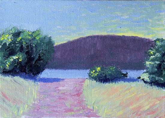
A Shady Path

Or is is a shady past?  Either way, I am not sure I like it.  I seem to have problems painting this type of scene.  I don't know if it is because of the value change from sunny to shaded areas or it is the wall of trees.  I think it will take a stab at painting something like this from life for me to have any success.

It was raining out all day and there was no way I was going to be able to get outside for the maiden voyage of plein air painting.  It is supposed to rain for the next three days, so it is photo reference time.  I might try a still life tomorrow.  It has been a while since I have painted from life.  Maybe I can get a couple of paintings done tomorrow.  We will see if I am up to it.

This is painted on a 4 x 6 canvas panel, using Windsor & Newton Artisan water mixable oil colors.  I used the same palette as yesterday.

#44


Doug

Monday, June 4, 2012

Breaking in the Thumbox

After taking Larry Seiler's course and chatting with him on WetCanvas, he inspired me to try plein air painting.  I figured painting in public couldn't be any more intimidating than posting paintings online for the whole world to see.  After a few years of doing that, I don't even think about it anymore, but I still remember the first few times I hit the send key.  So I know it will be a little scary the first couple of times, but hopefully it will become an addictive habit.

The first thing I needed was a painting box.  After doing some investigating I settled on a Guerrilla Thumbox.  This pochade box is very compact and suits my needs for painting 4 x 6, 5 x 7 and 6 x 8 panels.  Small paint tubes, short handled brushes, a palette knife, a small brush cleaner, a small oil tin and a few other objects can be stored inside the box below the sliding palette.  I hope to be able to mix my paint on the palette before going out to paint.  That should cut down the time needed to be in view of the public.  It also will also allow me to get right to painting when I get to the painting location.

I thought it might be a good idea to use the Thumbox in my studio to give it a try before going plein air painting.  It was a little different at first, but after a while it was just painting as normal.  There will be things to learn, but the only way to learn is to do it.  Maybe my next post will be a plein air painting.  We will see.

This painting is done on a 4 x 6 canvas panel and I used Windsor & Newton Artisan water mixable oil colors.  I used a split complementary palette of ultramarine blue, cadmium yellow medium and cadmium red deep hue along with titanium white.  I really like the greens you can make with this palette.

I am including a photo of the Thumbox with the painting.  Thanks for looking.

#43


The Guerrilla Thumbox


Doug

Wednesday, May 30, 2012

Which Way to the Beach?

I have painted this scene a few times in pastel, but this is the first time in oils.  There is something inviting about the composition.  Probably the path to the water leads the viewer into the painting.  The photo reference is by Paula Ford, a fabulous artist who has helped me over the past five years at WetCanvas.

We are lucky to be the proud owners of three of Paula's beautiful pastel paintings.  When I saw them in person for the first time it opened my eyes to how different paintings look when viewing them online.  It also showed me how far I still have to go as a painter.  Aim high!

This is painted on a 5 x 7 canvas panel using Windsor & Newton Artisan WMO's and I used the same palette as the last two paintings.  Thanks for looking.

#42


Doug


Tuesday, May 29, 2012

High Water

As soon as I saw the photo that I took last week at the bird sanctuary in Salmon Arm, I knew I had to paint it.  Now I'm not too sure.  Usually a shrub or tree would have a darker value than the background hill, but the photo showed differently.  I know you should never trust a photo, but it looked correct to me.  When you live in an area with evergreen trees everywhere you look, the hills and mountains can look very dark.  I guess I could just say the sun was shining on the shrub, but the background was cloudy.  Now that I am typing my thoughts out it makes perfect sense.  It is up to me to decide what the painting looks like and I can have the sun shine anywhere I want.  I feel better now that I won that argument with myself.  Or did I lose it?

Shuswap Lake is on the rise with the runoff of melting snow from the surrounding mountains and you get scenes like this quite often.  Normally this little bush would be far back from the lake, but right now it doesn't have to look too far for water.  It looks like it is just standing there in defiance, daring the lake to come any closer.  I don't know if I would have taken the photo a few months ago.  It wasn't a great photo, but I thought it could make an interesting painting.  I am learning to take photos for painting references now, not for beautiful photos.  There is a big difference.

This is painted with Windsor & Newton Artisan WMO's and is painted on a 4 x 6 canvas panel.  I used the same triad as yesterday.  The paint was a little sticky, but still workable.  I didn't time myself, but it probably took between thirty to forty minutes to paint.  

Thanks for looking.

#41


Doug Wasilieff


Monday, May 28, 2012

One Pastel and One Oil

Life has been hectic around here for the past week, but things are back to normal now and I should get back to painting more often.  Hopefully I can get back to painting daily, because I feel like I learn more when I paint for a few days in a row.  I guess one gets in a groove and you start doing things without thinking.  My wife says I do that all the time.

I have two paintings today.  The first is painted in pastels and it took a couple of days to finish.  It's not that it took that long, it was just trying to find time to paint.  It is always hard for me to go back to a painting the next day and continue painting.  Maybe it is because when you start a painting you vision it in your mind and if you have to stop painting and start again the next day, the vision is gone.  Could it be that the excitement is gone?  I know a lot of painters who take many sessions to complete a painting and they do a great job on it.  I think if you finish a painting in one sitting, it helps you achieve a looser look.  Makes sense to me.

Here is number 39, a pastel painting that is painted on 5 x 7 brown Pastelmat.  I did a little experiment with this one, using just the Maggie Price Value Set of Terry Ludwig pastels.  It is a sixty pastel stick set made up of ten hues and each hue has six values.  I kept track and I used eighteen sticks for the painting.  This would be a limited palette for pastels.  This is painted from a reference photo of mine.

#39


This is number forty.  A third of the way through the challenge.  It is a water miscible oil painting using Windsor & Newton Artisan paint and is painted on a 5 x 7 canvas panel that was toned with mud made from leftover paint from the last oil painting.  I used a limited palette again, but this time I used a triad of ultramarine blue, lemon yellow and cadmium red hue along with titanium white.  The same method as the last painting was used, mixing three tones of each hue and mixing the hues together, getting three tones of each mixture.  I really enjoy using a limited palette that is already mixed.  You just paint and don't worry about not having the "right" color.  You just use the closest color and value you have and go for it.  Fun stuff!

#40


Thanks for looking.


Doug Wasilieff

Tuesday, May 22, 2012

Pastel Painting Using the Same Reference Photo

When I was painting with oils yesterday I couldn't stop thinking how the painting would look using pastels.  Today I found out.  Although it has been a while since I had my sticks out, it felt good to get my fingers dusty again.  I think I will be able to go back and forth using pastels or oils, depending on my preference that day.

I wanted to keep a loose feeling to the painting.  Not too much detail.  I think my oil paintings are looser than my pastel paintings, but this is a step in the right direction.  There is a thread over in the Pastel Talk forum at WetCanvas about finding your style.  I have always said that I am waiting for my style to find me.  It may sound corny, but that is how I feel.  I don't think you can consciously pick your style without it looking forced.  When you start painting using the right side of your brain, painting in the zone, that is when your style emerges.  That's my theory and it's my blog so I can say what I want (hehe).

This is painted on 5 x 7 Belgium Mist Wallis sanded paper using a variety of soft pastels including Terry Ludwig, Mount Vision and Unison.  It took me about two hours.  Thanks for looking.

#38


Doug Wasilieff

Monday, May 21, 2012

WetCanvas WDE

Every weekend over at WetCanvas.com, they have a challenge called the WDE where a host posts sixteen photos and you pick one to paint or draw and post your results.  The goal is to take less than two hours to complete, but if you are not finished you take a photo and post it at the two hour mark and when it is finished you take another photo and post the results.  It is a fun challenge and can get you out of a rut.  This weekend was hosted by a fellow Canuck, mbeckett, who posted some wonderful photos to choose from.  Thanks, Mike.

I decided to continue with the water miscible oils and see what happens.  I am not too sure about this one, but it is another step to the 120 mark.  It is done using just three hues and white again.  I sure like painting with a limited palette and can see the advantages it would give an artist painting plein air.  Premix three tones in each hue and mix each color with another and make three tones of those.  This is done with a split complementary palette of lemon yellow, ultramarine blue and dioxazine purple along with titanium white.  I mixed a pile using all three colors and a little white and used it to tone the canvas to get rid of the white.  I also used a bit of the mixture to mute colors when I needed to tone the color down.   It is painted Windsor & Newton Artisan WMO's  and is painted on a 5 x 7 canvas panel.  It took just over an hour to complete.

Thanks for looking.

#37

Doug

Tuesday, May 15, 2012

Two More Oils

I feel bad about not posting for a while.  Life gets in the way sometimes and art has to take a backseat.  I have been dabbling with oils and gouache here and there, but mostly just experimenting and practicing mixing colors.  It will take a while getting used to mixing, but it is fun to see what you can create.

The first painting was done a few days ago.  I have no idea why I didn't post it.  Maybe it's because I don't like it.  I guess it's okay, but I felt lost when painting it and just couldn't do what I had in mind.  Oh well.  This is a learning experience and we get what we get.  It is painted with Windsor & Newton Artisan WMO's and is painted on a 9 x 7 canvas board I purchased at a dollar store.  Where else would you find something that size?

The second painting was done after watching Larry Seiler's last class where he discusses different palettes.  He mentioned a split complementary palette and mixing a dark, medium and light in each color and each mixed color.  I used ultramarine blue, cad red hue, cad yellow light and titanium white.  The green came from mixing blue and yellow... you get the picture.  It was nice having all your paint premixed and ready to go.  I could just grab whatever color and value I needed without much thought.  It could be that you might stay in the right brain mode because of the premixed paint.  It was sort of like painting with pastels, just not as many choices, which I find makes things easier.

Anyway, same paint as the first, but this is painted on a 5 x 7 canvas board.  I see white showing through.  The first time I didn't prime the surface.  Both were painted from my own reference photos.

Thanks for looking.

#34


#35


Doug

Tuesday, May 8, 2012

My First Oil Painting

I bought some Windsor & Newton Artisan water miscible oils about a year ago and other than doing a few black and white studies, this is my first ever oil painting.  I know some people don't consider WMO's to be true oils, but using them straight out of the tube, I can't see any difference.

After watching Larry Seiler's video, it was only a matter of time until I would give oils a go.  I am glad I did.  It was fun!  Holding a brush in my hand seems different than holding a pastel.  Both are used to put pigment onto a surface, but I seem to loosen up more with a brush.  More freedom?  I don't know, but I will be using oils more now that I have broken the ice.

This is painted with Windsor & Newton Artisan Water Miscible Oils and is painted on an 8 x 10 canvas board.  The photo reference is from the Image Reference Library at WetCanvas.com.

Thanks for looking.

#33


Doug

Monday, May 7, 2012

Gouache, Golly, Gee

I bought the download lesson's from Larry Seiler's webinar.  It is great to be able and sit back and listen to Larry's wisdom about painting.  The more I listen to the lessons and read the lesson notes, the more I realize how much I didn't retain from listening live.  Included in the package is a painting demo titled "Last Light Impressions."  I watched it last night and enjoyed it immensely.  I woke up thinking about painting.  Not only painting, but painting with a brush.

There are so many options at my fingertips.  I decided to do a small landscape using gouache.  I will save the oils for another day.  The gouache was still wet in my sta-wet palette from a week ago, which is nice to know.  Artist quality paint is not cheap, so finding ways to extend the time that the paint is usable is very beneficial.

Last week I primed some cold press watercolor paper with Art Spectrum Colourfix Rose Grey primer, thinking I could use pastel on it.  Maybe two coats wasn't enough, but I didn't like how the pastel went onto the surface.  In the past I have used a watercolor under painting on Colourfix, so I figured it could be used for a gouache painting.  It is nice starting a painting on a colored surface.

This is way out of my comfort zone.  I tried to keep it loose and just thought shapes.  I think the sky turned out okay, but I don't know about the rest of the painting.  Maybe because it is different from what I have done in the past.  Anyway, painting #32 is 5 x 7.

Thanks for looking.

#32


Doug